Home Delivery Packaging for Blue Robin
Year
2021
Client
Cardinal Health
Industry
Healthcare
Role
Product Designer
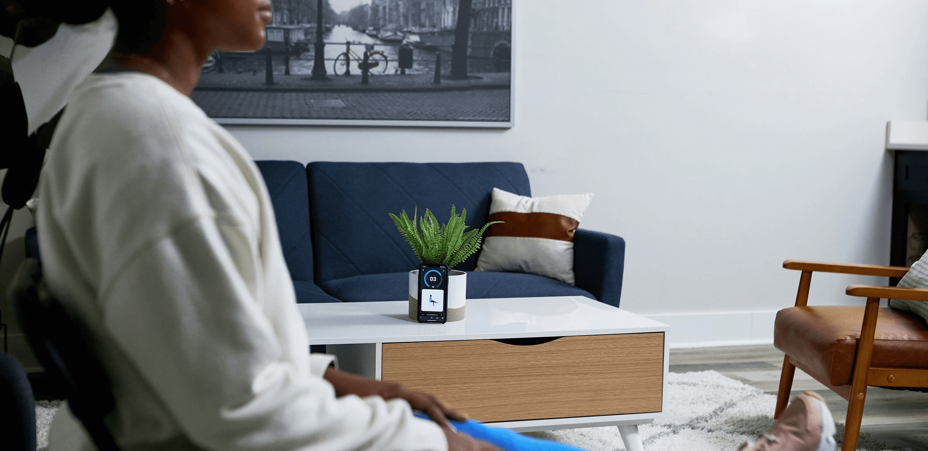
Blue Robin, a digital pharmacy app created by Cardinal Health, aimed to transform the pharmaceutical landscape by seamlessly integrating the digital and physical realms. Beyond the product's digital interface, the project also included pharmaceutical packaging, an integral part of the consumer experience.
Role & Responsibilities
As the Senior Product Designer for Blue Robin, I was entrusted with overseeing the visual identity and functional aspects of the product. Although Cardinal Health typically leveraged its internal marketing team for branding tasks, my intimate involvement with Blue Robin's development positioned me to play a pivotal role in the branding process. Collaborating closely with Jason Callori from the Cardinal Health Marketing team and John Vanderveen, a fellow designer on the Blue Robin project, we embarked on a design journey that covered every touchpoint of the brand.
Wireframe Creation
Prototyping
Feedback Analysis & Dissemination
UI Design
Quality Assurance
Challenges
01
Regulatory Hurdles
The design of the prescription packaging was hampered by the stringent guidelines of the pharmaceutical home delivery sector, demanding a blend of creativity and compliance.
02
Efficiency & Aesthetics
Crafting an economical packaging design that didn't compromise on aesthetics was key.
03
Document Storage
Accommodating the regulatory documentation, potentially spanning up to 20 sheets of standard-sized paper, posed significant design and space challenges.
Packaging Approach
Conceptualization
Brainstorming sessions with the product team set the stage for the packaging design journey.


Example of some variants we explored
Prototyping
Digital designs were transformed into tangible prototypes in collaboration with manufacturers, paving the way for real-world assessments.

Example of some variants we explored
Focus Group Testing
Prototypes were subjected to focus group scrutiny with Kari Coughlin, Service Designer at Cardinal Health, guiding the discussions. Feedback from these sessions determined the final packaging choice.

Example of some variants we explored
The Output
Packaging
The chosen packaging design was a marriage of form and function. While it catered to the essential requirements of medication storage and regulatory documentation, it also sought to elevate the unboxing experience. Though my journey with Cardinal Health concluded before the official rollout, the groundwork laid promised an enhanced user experience.
Example of some variants we explored
Results
The journey of branding and packaging Blue Robin was a testament to the interplay of design aesthetics, user-centricity, and market constraints. The resulting brand identity and packaging solution reflected a careful consideration of user feedback, market trends, and regulatory guidelines. The enthusiastic reception from users reinforced the effectiveness of our design approach and strategies.

Designed & Built by Brady Jacobsen
©2023